Webbo3 Data Analysis Bootcamp · Power BI Module · Lesson 1
Introduction to DAX: Understanding Data Analysis Expressions, Columns, Measures, and Formatting
A foundational lesson covering what DAX is and why it matters, the critical difference between calculated columns and measures, how to build basic measures from scratch, and how to format them for professional reporting.
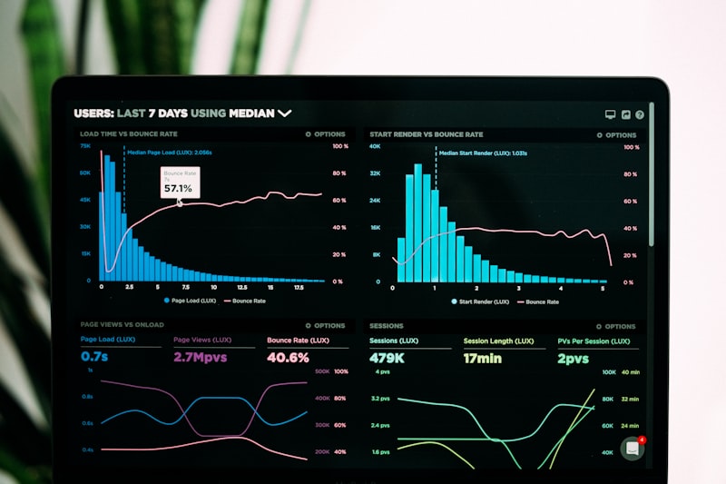
You have learned to clean data in Excel, query databases with SQL, and design dashboards. Now you enter the world of Power BI, and with it, DAX. DAX stands for Data Analysis Expressions. It is the formula language that powers every calculation in Power BI, Microsoft Analysis Services, and Power Pivot for Excel. If Excel formulas are like speaking a local dialect, DAX is the formal language of business intelligence. It looks similar to Excel at first glance, same functions, same operators, familiar syntax, but it behaves fundamentally differently because it operates on tables and filter contexts, not individual cells. This lesson is your entry point. You will learn what DAX is, why it is non-negotiable for serious reporting, the single most important distinction in the language, the difference between calculated columns and measures, and how to create and format your first basic measures. Everything else in Power BI builds on this foundation.
1. What Is DAX and Why It Matters
DAX is a functional language. Every DAX expression is a function call, or a combination of function calls, that returns a value. It was created by Microsoft specifically for tabular data models, and it is designed to handle millions of rows efficiently while responding dynamically to user interactions like slicers, filters, and drill-downs. Unlike Excel, where a formula lives in a single cell and references other cells, DAX formulas live in the data model and operate on entire columns or tables at once.
DAX is not Excel. This is the first mental shift you must make. In Excel, you type =B2*C2 into a cell, and the formula calculates for that one row. In DAX, you write a measure that says SUM(Sales[Revenue]), and it calculates the total revenue across the entire Sales table, automatically adjusting when a user clicks a slicer to show only one region. The formula does not live in a cell. It lives in the model, and it recalculates every time the filter context changes. This dynamic recalculation is what makes Power BI dashboards interactive, and it is why DAX is more powerful than Excel formulas for large-scale reporting.
DAX is the bridge between raw data and insight. Power Query brings your data into the model. Relationships connect your tables. DAX turns that connected data into answers. Without DAX, your Power BI report is just a collection of tables and charts showing raw numbers. With DAX, you can calculate year-over-year growth, running totals, profit margins that adjust by product category, customer lifetime value, and countless other business metrics. Every number on a Power BI dashboard that is not a direct database column is produced by DAX.
DAX is industry standard. Power BI is the leading business intelligence tool in the market, and DAX is the language that drives it. Job postings for data analysts, business intelligence developers, and financial analysts routinely list DAX as a required skill alongside SQL and Excel. Learning DAX does not just make you better at Power BI. It makes you fluent in the logic of tabular data models, which transfers directly to Analysis Services and Power Pivot. The time you invest here pays off across the entire Microsoft data ecosystem.
One more reason DAX matters: it is fast. A well-written DAX measure can calculate across millions of rows in milliseconds because it leverages the xVelocity in-memory engine, which compresses data and evaluates formulas in parallel. A poorly written DAX measure, however, can bring a report to its knees. Understanding DAX fundamentals is not just about writing formulas that work. It is about writing formulas that scale.
2. Calculated Columns vs Measures: The Difference
This is the most important concept in DAX, and the one that confuses beginners the most. Calculated columns and measures both use DAX syntax. They both produce values. But they are evaluated at different times, stored differently, and used for completely different purposes. Getting this wrong leads to bloated models, slow reports, and incorrect numbers. You must understand the distinction before you write a single formula.
Calculated columns are computed row by row and stored in the model. When you create a calculated column, DAX evaluates your formula once for every single row in the table, stores the result in a new column, and that column becomes part of the data model permanently. It behaves exactly like a column you imported from a database. You can use it in slicers, filters, rows, and columns of visuals. But because the values are pre-computed and stored, calculated columns consume RAM and increase your file size. They are calculated during data refresh, not when a user interacts with a report.
Here is an example of a calculated column. Suppose you have a Sales table with Quantity and Unit Price columns, and you want a Revenue column for each row. In Power BI, go to the Data view, select the Sales table, click New Column in the Modeling tab, and type:
Revenue = Sales[Quantity] * Sales[Unit Price]
Power BI evaluates this formula for every row, multiplies Quantity by Unit Price for that specific row, and stores the result in a new column called Revenue. You can see this column in the Data view. It occupies memory. If your Sales table has one million rows, the calculated column stores one million values. The calculation happens at refresh time, so when a user opens the report, the values are already there.
Measures are computed at query time and not stored in the model. A measure is a formula that sits in the model as source code only. It does not store values. When a user drags the measure into a visual, or when a slicer changes the filter context, the measure evaluates on the fly, considering only the rows that are currently visible. Measures do not increase your file size because they do not store pre-computed results. They use CPU during report interaction, not RAM during refresh.
Here is the same calculation as a measure. Click New Measure in the Modeling tab and type:
Total Revenue = SUMX(Sales, Sales[Quantity] * Sales[Unit Price])
SUMX is an iterator function. It goes through each row of the Sales table, calculates Quantity multiplied by Unit Price for that row, and then sums all the results. The key difference: this measure does not create a new column. It produces a single aggregated value that appears in a card, a table total, or a chart axis. If a user filters the report to show only the Lagos region, the measure recalculates using only Lagos rows. A calculated column cannot do this, because its values were fixed at refresh time and know nothing about user filters.
When to use which. Use a calculated column when you need the result to behave like a physical column: for slicing, filtering, grouping, or categorizing. For example, creating age brackets from birth dates, or flagging high-value customers row by row. Use a measure when you need an aggregate value that responds to filters: total sales, average order value, count of unique customers, profit margin percentages. As a general rule, if you can solve a problem with either a measure or a calculated column, choose the measure. It keeps your model lean and your reports fast.
The golden rule. Calculated columns consume memory. Measures consume CPU. Memory is harder to scale than CPU. Therefore, prefer measures. Only use calculated columns when the physical structure of the column is required by the report, such as placing the result in a slicer or using it as a relationship key.

3. Basic Measures: SUM, AVERAGE, COUNT, DISTINCTCOUNT, MIN, MAX
These six functions are the building blocks of DAX. They are called aggregation functions because they take a column of values and reduce them to a single summary value. Every complex measure you will ever write starts with one of these, or with an iterator like SUMX that wraps one of these. Learn them perfectly.
SUM: adding numbers. SUM takes a numeric column and returns the total of all values in the current filter context. It is the most common measure in business intelligence.
Total Sales = SUM(Sales[Revenue])
If you place this measure in a card visual with no filters, it shows the sum of all revenue in the Sales table. If you place it in a bar chart broken down by region, it shows the sum of revenue for each region separately. The same measure produces different values depending on the filter context. That is the power of DAX.
AVERAGE: the arithmetic mean. AVERAGE sums the values and divides by the count of non-blank values. It ignores blank cells, not zeros. A zero is included in the calculation. A blank is excluded.
Average Order Value = AVERAGE(Sales[Revenue])
Use AVERAGE when you want the typical value of a numeric column. Be careful with outliers. If one transaction is a million naira and the rest are under ten thousand, the average will be misleadingly high. In those cases, AVERAGEX with a filtered table, or MEDIAN, gives a better picture.
COUNT: counting rows with values. COUNT counts the number of rows in a column that contain numeric values. It ignores text, blanks, and errors. If you need to count rows regardless of data type, use COUNTA instead.
Transaction Count = COUNT(Sales[TransactionID])
DISTINCTCOUNT: counting unique values. DISTINCTCOUNT is one of the most valuable functions in analytics. It counts how many unique values exist in a column, ignoring duplicates. This is how you calculate metrics like unique customers, unique products sold, or unique regions with activity.
Unique Customers = DISTINCTCOUNT(Sales[CustomerID])
If a customer made ten purchases, COUNT would count ten rows. DISTINCTCOUNT counts that customer once. This distinction is critical for customer analytics. Never use COUNT to count customers unless you are absolutely sure each row represents a unique customer.
MIN and MAX: finding boundaries. MIN returns the smallest value in a column. MAX returns the largest. They work on numbers, dates, and text. For text, MIN returns the earliest alphabetical value. For dates, MIN returns the oldest date.
First Sale Date = MIN(Sales[SaleDate])
Last Sale Date = MAX(Sales[SaleDate])
Lowest Price = MIN(Products[UnitPrice])
Highest Price = MAX(Products[UnitPrice])
These are often used in combination with other functions. For example, you might calculate the number of days between the first and last sale date to determine the active period of a customer.
A note on blank handling. All these functions ignore blank values in the column, except COUNT which only counts non-blank numeric values. If your data has meaningful zeros, make sure they are stored as 0 and not as blank, because blank is treated as missing data and excluded from aggregation.
4. Creating a Measure from Scratch
Now that you know what measures are and which functions exist, here is the exact workflow for creating one in Power BI Desktop. Follow these steps precisely.
Step one: select the table. In the Data view or Report view, select the table where you want the measure to live from the Fields pane on the right. The table you choose does not affect the calculation logic, because measures can reference any table in the model. But organizing measures in the correct table makes your model easier to navigate. Place revenue measures in the Sales table, customer measures in the Customers table.
Step two: open the formula bar. Click New Measure in the Modeling tab of the ribbon. A formula bar appears at the top of the screen, just like in Excel. The cursor is ready for input.
Step three: name your measure. Type the measure name, followed by an equals sign, followed by your DAX expression. For example:
Total Profit = SUM(Sales[Revenue]) - SUM(Sales[Cost])
The measure name is Total Profit. The equals sign assigns the DAX expression to that name. The expression subtracts the total cost from the total revenue. Notice that you do not type the table name before the measure name in the formula bar. You only type the measure name and the expression.
Step four: confirm and validate. Press Enter or click the checkmark in the formula bar. Power BI validates the syntax. If there is an error, a red squiggly line appears under the problematic part, and an error message displays below the formula bar. Read the error carefully. Common mistakes include misspelled column names, missing brackets around column references, and using a column reference without an aggregation function inside a measure.
Step five: use the measure in a visual. Your new measure appears in the Fields pane under the table you selected, with a calculator icon beside it. Drag it into a card visual to see the overall value. Drag it into a table visual alongside a region column to see it broken down. Drag it into a line chart with a date axis to see the trend. The measure evaluates correctly in every context because DAX automatically applies the filter context of the visual.
Step six: organize with measure tables. As your model grows, you may have dozens of measures scattered across multiple tables. Some analysts create a dedicated empty table called _Measures or Key Measures and move all measures there for easy access. To do this, go to Modeling → New Table and type a formula that creates an empty table, for example:
_Measures = {BLANK()}
Then hide the blank column, and use this table as a container for all your measures. This is an organizational preference, not a technical requirement, but it becomes essential once you have more than twenty measures.

5. Formatting Measures: Currency, Percentage, and More
A measure that calculates correctly but displays as a plain number is unprofessional. Formatting turns raw output into readable business communication. Power BI gives you precise control over how measures appear in visuals, and you should set this immediately after creating each measure.
Currency formatting. Select your measure in the Fields pane. In the ribbon, go to the Measure tools tab, which appears automatically when a measure is selected. Click the dropdown under Format and choose Currency. Select your symbol, for example ₦ for naira, $ for dollars, or € for euros. Set decimal places to 2 for standard currency display, or 0 if you are dealing in whole units. The Display units dropdown lets you show values as Thousands, Millions, or Billions, which is useful for large totals that would otherwise overflow the card visual.
Percentage formatting. For ratios, margins, and growth rates, select Percentage from the Format dropdown. Set decimal places to 1 or 2 depending on the precision your audience needs. A profit margin of 0.2345 becomes 23.5% automatically. Without this formatting, users see 0.2345 and must mentally convert it, which introduces friction and errors.
Whole number and decimal formatting. For counts and quantities, choose Whole Number. For averages and rates that are not percentages, choose Decimal Number and set the appropriate decimal places. Be consistent. If one measure shows two decimal places and another shows four, your report looks sloppy.
Conditional formatting in visuals. Beyond the measure-level formatting, you can apply conditional formatting inside visuals. For example, in a table visual, go to the Format pane, find the column for your measure, and turn on Background color or Data bars. This adds color scales or mini bar charts inside cells, making high and low values instantly visible. This is a visual formatting choice, not a DAX formatting choice, but it works together with your measure formatting to create a polished report.
Formatting best practices. Format every measure immediately after creating it. Do not wait until the end of the project. Unformatted measures make debugging harder because you cannot quickly distinguish a currency value from a percentage from a raw count. Use descriptive measure names that include the unit, for example Average Order Value NGN, Profit Margin Pct, or Customer Count. This helps other developers and your future self understand what the measure represents without opening the formula bar.
A warning about implicit formatting. Power BI sometimes guesses formatting based on the column data type. Do not rely on this. A column of 0 and 1 values might display as whole numbers when you need percentages. A revenue column might display without thousand separators. Always set the format explicitly. Explicit formatting is part of the measure definition and travels with the measure when you copy it to another report.

Quick recap: DAX is the formula language of Power BI, designed for tabular data models and dynamic filter contexts · Calculated columns evaluate row by row at refresh time and are stored in the model, consuming RAM · Measures evaluate at query time based on filter context and consume only CPU, making them preferred for most calculations · SUM, AVERAGE, COUNT, DISTINCTCOUNT, MIN, and MAX are the core aggregation functions · Create measures via New Measure in the Modeling tab, name them clearly, and validate syntax before using · Format every measure immediately: Currency for money, Percentage for ratios, Whole Number for counts · Organize measures logically, and consider a dedicated _Measures table for large models.
Using AI to Move Faster in DAX
DAX has a steep learning curve because it looks like Excel but behaves like a database query language. AI can flatten that curve by generating starter formulas, explaining errors, and helping you choose between calculated columns and measures before you commit to a design.
1. Use Copilot to generate DAX measures from business questions.
When your manager asks for average revenue per unique customer by region, describe it to Copilot: "Write a DAX measure that calculates average revenue per distinct customer, broken down by region in a table visual." Copilot will likely suggest something like AVERAGEX(VALUES(Sales[CustomerID]), CALCULATE(SUM(Sales[Revenue]))). Your job is to verify the logic, check that the column names match your model, and test it in a table visual against a few rows you can calculate manually. AI gives you the syntax. You provide the validation.
2. Ask AI to explain whether you need a calculated column or a measure.
If you are unsure, describe your scenario: "I need to categorize customers as High Value or Low Value based on their total spend. Should I use a calculated column or a measure in DAX?" AI will explain that because you need the category in a slicer, a calculated column is required, but it will also warn you about the memory cost and suggest an alternative using a disconnected table and a measure if appropriate. This prevents the most common DAX mistake: creating a calculated column when a measure would have been better.
3. Debug DAX errors with AI assistance.
DAX error messages can be vague. If you get "A single value for column Revenue cannot be determined," paste the full error and your formula into an AI assistant and ask: "Why is DAX throwing this error, and how do I fix it?" AI will explain that you referenced a naked column inside a measure without wrapping it in an aggregation function like SUM or MIN, and it will suggest the corrected formula. This turns hours of forum searching into a two-minute conversation.
4. Generate a complete measure library from a data dictionary.
If you have a list of business metrics your organization tracks, paste the list into AI and ask: "Generate a DAX measure library for a retail dataset with these metrics: total revenue, average transaction value, unique customer count, profit margin percentage, and year-over-year growth." AI will produce a full set of measure definitions with appropriate formatting suggestions. You can then copy them into Power BI, adjust column references, and have a working foundation in minutes instead of hours.
5. Verify AI-generated DAX against filter context behavior.
AI can write syntactically correct DAX that produces the wrong number in a specific visual context. Always test new measures in multiple visuals: a card for the grand total, a table for row-level detail, and a chart for trend validation. If a measure works in a card but shows the same value for every row in a table, the AI probably forgot to remove an ALL filter or used the wrong iterator. Your understanding of filter context, which this lesson introduced, is what catches these errors. AI writes the formula. You own the logic.
A habit worth building from this lesson onward: before creating any DAX calculation, ask yourself whether the result needs to respond to user filters. If yes, use a measure. If no, and you need the result as a physical column for slicing or grouping, use a calculated column. When in doubt, start with a measure. Then, if you need a formula, describe your goal to AI, get a draft, and validate it in three different visuals before calling it complete. This workflow keeps your models fast, your reports accurate, and your learning curve manageable.
Next lesson: filter context, row context, and iterator functions like SUMX and AVERAGEX.